All Good Brands Need a Little White Space
- Dec 21, 2023
- 4 min read
Updated: Apr 20, 2024
It's true. Elevated and high-end brands intentionally allow for plenty of white space in their branding and design. However, that's not the type of "white space" I'm talking about today—although it's safe to say all good brands still need this kind of "white space" for their business.
Working with and for my friend Maddie Peschong, a successful local brand photographer and entrepreneur, has been a dream of mine for a long time. I'm delighted to say that working with her was truly the dream I thought it would be!
I was thrilled to be given the opportunity to help her re-brand her business, White Space Studio. The business continues to grow and mature, and she is in the process of building and opening a brand new photography studio, so it was the perfect time to give her brand a huge glow-up.
Prior to investing in her brand, Maddie had chosen to run with a standard sans-serif font to have a basic visual presence online, but she had never really invested much in building out her brand strategy or her visual identity. We had so much fun getting together and unpacking everything about her brand, giving her a look that authentically represents the true magic and style of White Space Studio.
Going forward, Maddie can now confidently share her brand (she's already made a T-shirt with her new logo and wears it proudly!) and lean into her brand strategy to help continue to grow her brand awareness, increase bookings, and build her membership base—and, in turn, increase her revenue. It's a win-win. ✨

Brand Essence
During our brand strategy session, we focused on clarifying White Space Studio's brand story, values, voice, mission, market fit, and so much more. Brand keywords are also a great way to get to the "essence" of a brand. For White Space, those keywords included:
Aesthetic
Clean + Bright
Welcoming
Accessible
Simple
Creative
Project Details
We provided White Space Studio with a full suite of branding, design and collateral pieces:
Behind the Design
In approaching the visual identity for White Space Studio, we aimed to create a look that is modern and clean and gives off those ‘big sister’ vibes.
She’s edgy yet refined, bold yet understated.
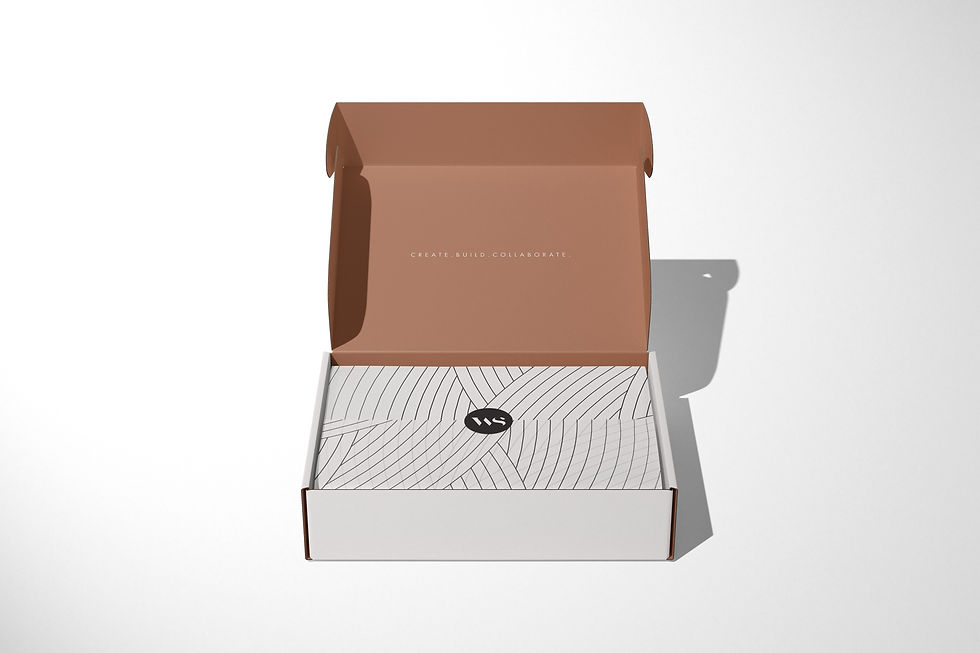
The simplicity in the design gives a sense of elegance. The added white space in the custom lettering is a nod to the business name and the meaning behind it — a white space (blank canvas) for creatives that can also help create white space in their lives. A custom brandmark was created using the ‘w’ and ‘s’ letter shapes and a custom pattern was created to add texture and depth to the overall look.
Below is the curated imagery, or mood board, that inspired the design direction.

The primary logo includes a customized wordmark using an elegant serif typeface balanced with a sans serif typeface for the word “studio”.
The missing pieces of the letters provide negative space, creating the effect of “white space” in the logo. The words are still very legible as our brain naturally fills in the gaps of what should be there.

Brand Patterns & Textures
We created two different custom brand patterns for the White Space Studio brand. The first one utilizes elegant, flowing and overlapping lines that creates a look that is complimentary to the primary logo. The second pattern utilizes the WS icon in a repeating layout that looks great in all of the White Space brand colors.
Patterns and textures can be applied to many different collateral pieces, including on the back of a letterhead, on tissue paper, or in the inside flap of an envelope for a brand that feels elevated and intentional.


Brand Colors
The color palette for White Space Studio is combination of bold and feminine. The primary colors are black and terracotta with mist and ivory being used as secondary accent colors within the brand.
After researching area businesses with similar offerings, we found that many of them utilized some form of green in their branding. So to intentionally set White Space Studio apart, we opted to highlight terracotta as a primary color.
During the brand strategy phase, I always research the psychology behind the colors to make sure that the impact they will have on our emotions aligns with what we establish during the brand strategy phase. I study individual colors as well as how they interact with each other as a whole to determine a palette that has depth and meaning and stirs up feelings that perfectly align with the brand.
Black: refined, elegant, sophisticated
Terracotta: feminine, comfort, calm
Mist: wisdom, growth, tranquility
Ivory: simplicity, relaxed, luxury

Branding Beyond the Logo
Once the logos and all visual elements were established, we created a variety of collateral pieces to ensure a consistent experience anytime someone sees or interacts with the White Space brand.


To learn more about White Space Studio, visit whitespacesiouxfalls.com. If you're in need of stellar brand photography, Maddie Peschong Photography is where it's at. Seriously, she's the best of the best.
If you are looking to give your brand a massive glow up, let's chat! Contact me for a free introductory call to learn how we can help you elevate your brand and your confidence as a business owner.


